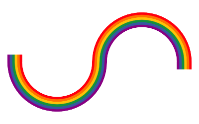
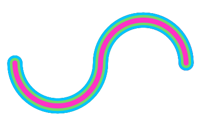
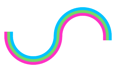
I found myself wanting to make an image where a pride rainbow followed a specific path. For reference, here's an idea of the kind of thing I wanted to make:
As usual I fired up Affinity Designer, my vector image editor of choice, thinking it surely must be possible to do so in a few straightforward steps.
Oh how wrong I was.
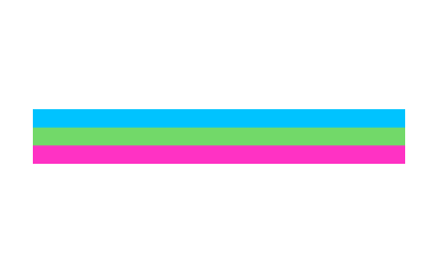
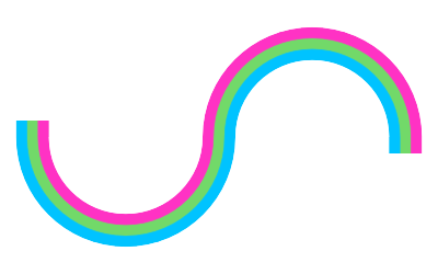
At the end I'll explain exactly how I ended up doing it, but first I want to take you on the journey I went on. To simplify things a bit, I'll make a 3-colour stripe instead of 6, but the steps are exactly the same. Here's the pattern we're going to use:
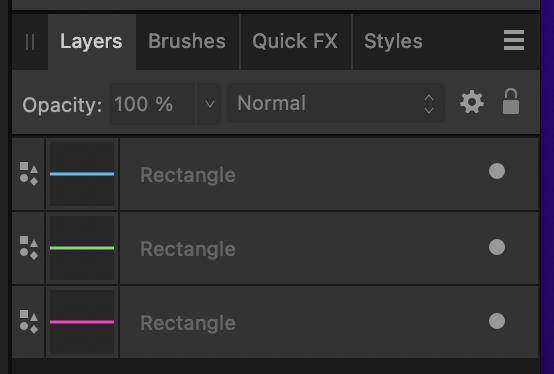
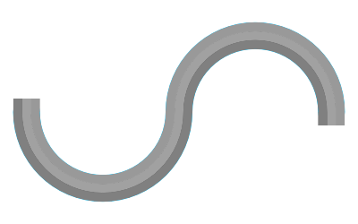
Very simple to do if you only want straight lines! This can be made by aligning three rectangles.
So let's start trying to solve this problem.
The first thing I tried was to apply multiple strokes to the same path using the Appearance panel.
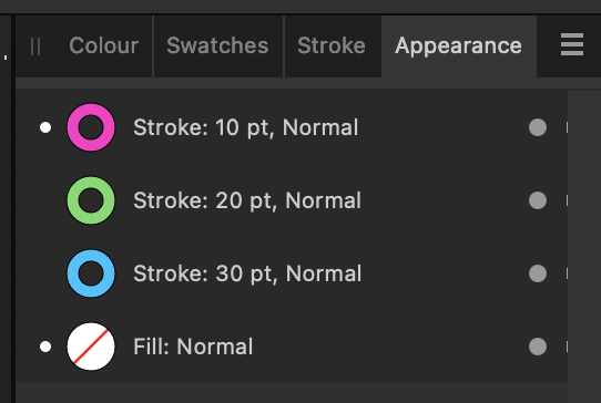
Doing this causes the strokes to overlap like layers, and you can create something that approaches what we're looking for:
But it's not quite right; we want one stripe of each colour, and here we have two blue and two green stripes. While searching around for solutions to this, I learned an interesting fact: that this effect is similar to découpage, although that is a physical art form.
I couldn't find any ways to use this stacking effect without causing the doubled up stripes, so it was back to the drawing board.
My next idea was to use a gradient. A stripe effect can be created by carefully overlapping the colour stops so that they don't fade into one another but instead change immediately.
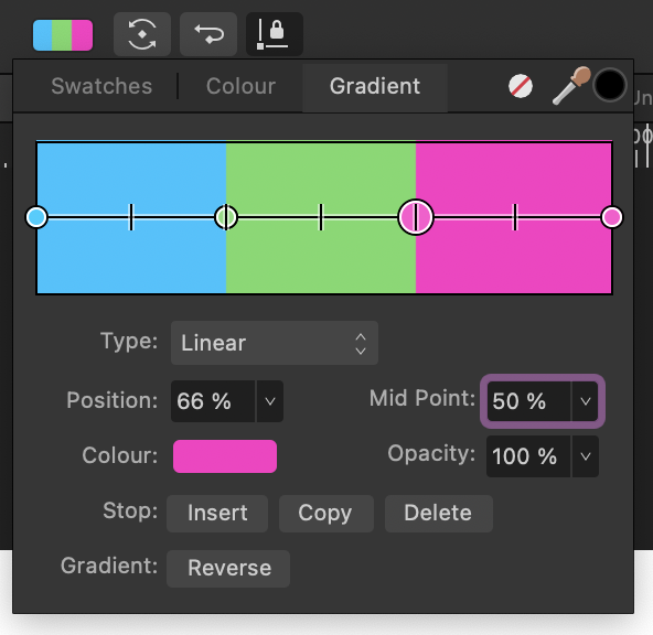
There are six colour stops forming the above gradient; blue at 0%, blue and green overlapping at 33%, green and pink overlapping at 66%, and pink at 100%. The overlap is what causes the hard break between colours.
My previous experiments with this gradient technique led me to think I could create my stripey stroke by doing a similar thing. But as soon as I started, before even adding the overlapping colour stops, I realised there's a problem with how Affinity Designer handles gradients inside shapes:
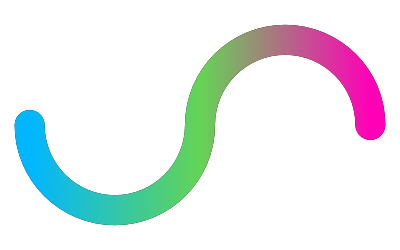
It essentially treats the shape as a mask over the gradient. That is, you can imagine the gradient is secretly rendered as a rectangle behind the shape, and the shape itself is a cutout allowing us to see the gradient through it. The gradient doesn't actually follow the shape.
We recently passed the 10 year anniversary of someone requesting the ability to have the gradient follow the shape, but sadly it hasn't made its way into the app yet.
However, while perusing the forums to see what people had to say about gradients and strokes, I discovered a post describing a way to do exactly what we want!
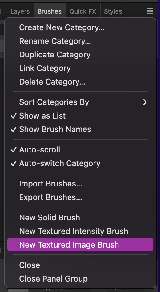
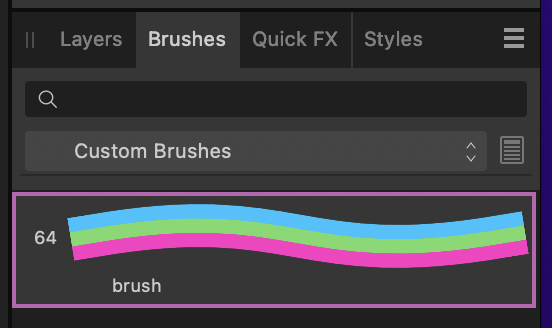
They don't describe exactly how to do it, so I'll do so here as a way of documenting the method. What they're talking about is the option to create a brush using an image as a repeating texture. This is found in the Brushes panel, in the context menu listed as "New Textured Image Brush".
Choosing this option asks you to select an image file to use as the texture. For our case, we can create a square image that has the three stripes we're interested in (in fact, I used the three rectangles method to do so). Here's that image:

Selecting the texture image creates a new brush, and you can immediately see how it's going to help our mission.
So all we need to do now is apply this brush to our path, and we'll be done! I didn't actually know you could do this before now, so it was interesting to find out about this option.
It's actually very easy: in the Stroke panel, choose the option that looks like a brush, then in the Brushes panel choose the brush you want to use.
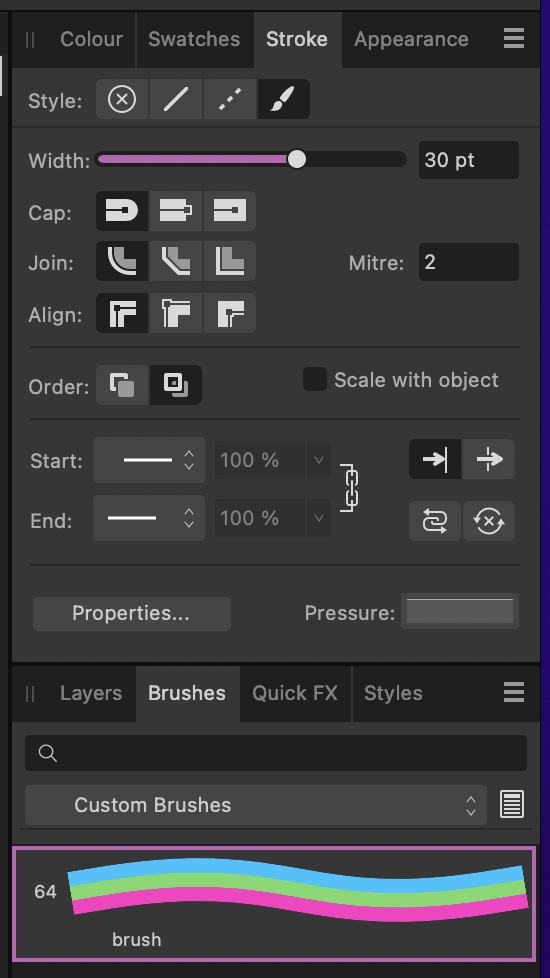
Then set the stroke width, and we'll be done! Wait, that doesn't look right...
What's going on here? It took me a while to figure out, but the stroke still has a colour set, so it's not using the colours from the texture. Just clear the stroke colour in the Color panel and it'll suddenly use the right colours.
There's just one last issue: we wanted the blue stripe to be at the top, and this version is upside down for some reason. This can happen based on the direction you drew the path in, but it's easily fixed without having to make a new brush.
Select the path in the Layers panel, then switch to the Node tool. In the top toolbar is an option labelled "Reverse Curves". Choose that and it'll flip the texture around so it looks correct!
It looks great, but there are some limitations to this technique:
- If you need to change the colours, you have to edit the texture image and make a whole new brush. You can't edit the existing one.
- The stroke caps cannot be rounded. Even if you choose the rounded option, they'll stay straight. It might be possible to fix this by adjusting the brush, but I don't know enough about brushes to know how.
- It can look a bit funky if the path has very tight curves. That means it doesn't work very well for text.
- You can't add arrow heads to the path.
But I think this technique can still be used to great effect in a lot of cases!
As a final note, here's the texture image I used to create the actual rainbow from the very start of the post. You can just download it directly and use it as a brush.
